Last week, I shared very grim data, going all the way back to 1880, on the growth of the welfare state.
 I even claimed that the accompanying graph was the “western world’s most depressing chart” because it showed the dramatic increase in the burden of government spending for redistribution programs.
And I didn’t even mention that the numbers likely will get even worse because of changing demographics.
Now it’s time for the western world’s second-most depressing chart. Like the first chart, the data for this second chart comes from “Our world in data,” only this time it shows the relentless and astounding (in a depressing way) expansion in tax burdens starting in 1868. It only shows four countries, but other western nations would show the same pattern.
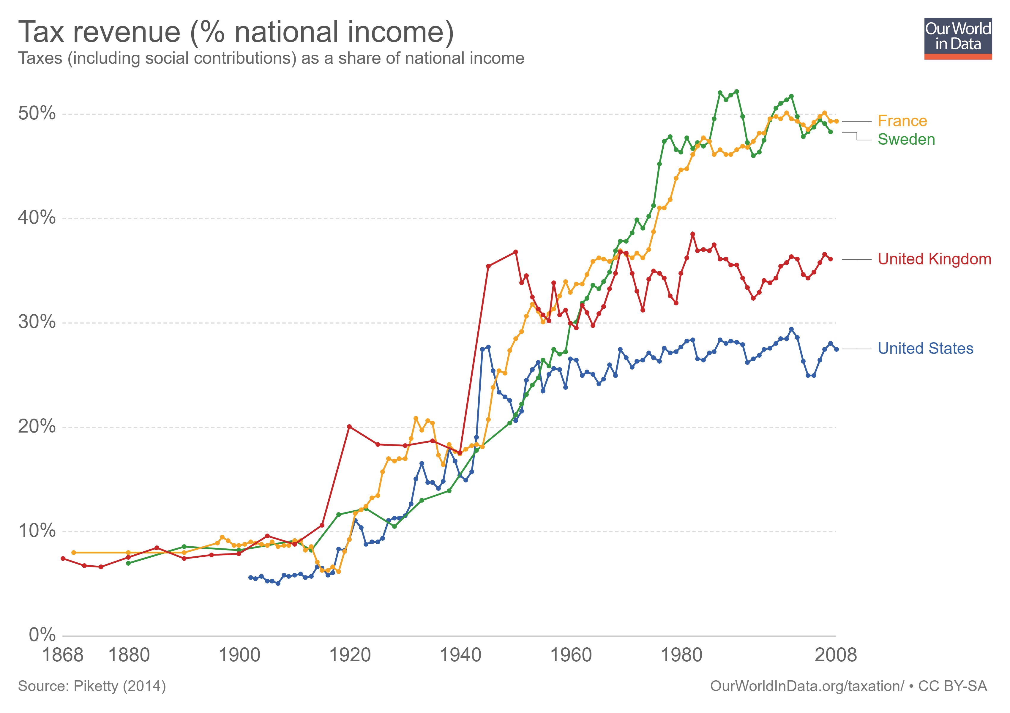
What isn’t shown in this chart is that the tax burden used to be reasonable because governments generally did not have income taxes.
The United Kingdom was an early adopter, but France, Sweden, and the United States didn’t impose that onerous levy until the 1900s.  And it’s no coincidence that the tax burden exploded once politicians learned to exploit that source of revenue.
An obvious lesson is that it is never a good idea to give politicians a new source of revenue. We see in the above chart what happened once nations imposed income taxes. We’ve also seen increases in fiscal burdens in nations that imposed value-added taxes (which is why Americans should fight to their dying breaths before allowing that levy in the United States).
From the perspective of politicians, they like new sources of revenue because that increases “tax capacity,” which is an Orwellian term that describes their ability to grab more money from the economy’s productive sector.
And here’s another chart from “Our world in data” showing how income taxes and VATs (along with income-tax withholding) have become ubiquitous.

Very depressing trends. Reminds me of the biased grading of tax regimes from the World Bank.
Let’s close with the tiny bit of good news from the website. Here’s a chart showing how top rates for the personal income tax dropped substantially between 1979 and 2002.
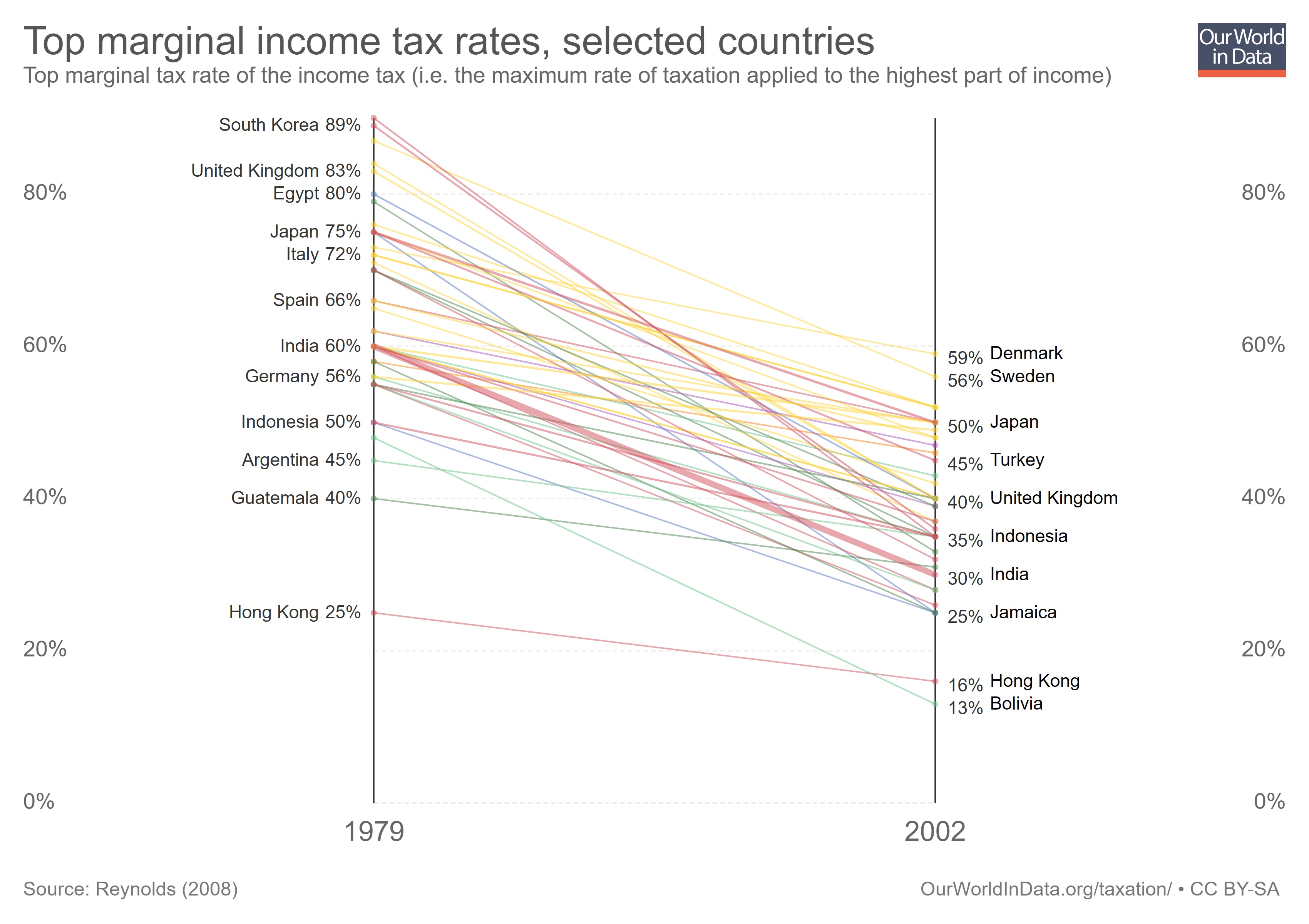
This happened, needless to say, because of tax competition. As globalization expanded, it became easier and easier for taxpayers to move themselves and/or their money from high-tax nations to low-tax jurisdictions.
Politicians thus were forced to lower tax rates so the geese with the golden eggs didn’t fly away.
Sadly, updated versions of this chart now show top tax rates heading in the wrong direction, in large part because tax havens have been weakened and politicians no longer feel as much competitive pressure.

[…] Though it is important to realize that the taxes needed to fund redistribution also are harmful (the magnitude of the problem can be viewed here and here). […]
[…] done that with regional data and also looked at depressing data from specific […]
[…] done that with regional data and also looked at depressing data from specific […]
[…] taxes drain huge amounts of money from people’s pockets and government budgets now divert immense amounts of money from the […]
[…] you believe in limited government and you’re looking back in time, this example or this exampleare good […]
[…] you believe in limited government and you’re looking back in time, this example or this example are good […]
[…] a version of this data, calling it the “world’s most depressing chart” – all of which was made possible by the imposition of income […]
[…] a version of this data, calling it the “world’s most depressing chart” – all of which was made possible by the imposition of income […]
[…] a version of this data, calling it the “world’s most depressing chart” – all of which was made possible by the imposition of income […]
[…] data, calling it the “world’s most depressing chart” – all of which was made possible by the imposition of income […]
[…] recently explained the evolution of taxation – and the unfortunate consequences of income taxation – to a seminar in the country of […]
[…] the chart that the explosion of redistribution spending only occurred after politicians obtained a new source of revenue (a problem that was exacerbated in Europe when politicians adopted value-added taxes and were able […]
[…] the chart that the explosion of redistribution spending only occurred after politicians obtained a new source of revenue (a problem that was exacerbated in Europe when politicians adopted value-added taxes and were able […]
[…] we want to solve the problems caused by the western world’s second-most-depressing chart, we’ll need to figure out how to reverse all the bad policies that produced the western […]
Too many people on the far right and left live in echo chambers and it will burn the “civilized” world to the ground. The poor don’t lobby or legislate – it’s the benefactors of genetics and inherited wealth ON BOTH SIDES that have created the problems of government and society. The comfortable have to choose to be less comfortable, less secure – that is risk what they personally care about most (themselves) to affect any positive change. The current poor would do no better if they had been the ones born with a silver spoon. We all have Human Nature in common and until there are leaders willing to wrestle against its’ tendencies, demonstrably, the blame game will continue.
Proof that competition works. Now only if the USA had competition between the States in its Constitution. Oh, wait, wasn’t that supposed to be the purpose of the 10th Amendment?
Yes, but “Taxes are the price we pay for civilization”.
Therefore, when we finally arrive at one hundred percent taxation we will have achieved the perfect civilization.
Even the IRS uses our own tax dollars to promote this message — talking about being forced to finance your own demise. Reminds me of prisoners at Auschwitz being forced to make the “Arbeit macht frei” sign.
PS. Of course the shape of the tax graph is the same as the shape of the government size trendline graph. Borrowing and deficits can only provide a small buffer– a couple of decades of illusion at best.
Reblogged this on Truth Is Power.