If it wasn’t for the fact that so many people are suffering and being seduced into empty lives of government dependency (symbolized by Julia, the world’s most disappointing daughter), I might feel sorry for President Obama.
He promised unemployment would never climb above 8 percent if Congress squandered $800 billion on a Keynesian stimulus scheme.
Well, Congress said yes and the results have not been pretty. And every month we get new numbers to show us that the Administration’s policies have failed. It’s like Chinese water torture for the White House.
The numbers released this morning from the Department of Labor don’t change the narrative. The Republican and Democratic spin-doctors obviously will spit out their talking points, but here’s a visual put together by Political Math that trumps all the political maneuvering. If you’re wondering where Obama is, look at the lower left portion of the image.
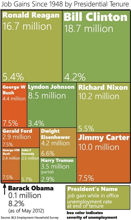
This image is a couple of months old, but job creation has been so anemic that the naked eye wouldn’t be able to tell the difference if it was updated.
Since I normally show a graph with the actual unemployment rate compared to what Obama promised, I’ll add that as well. Not a pretty picture. I wrote that last month’s version would cause anxiety for Obama, and see no reason to change that assessment.
Yes, the official unemployment rate dropped to 8.1 percent, but that was because more Americans dropped out of the labor force.

Most important, the rate of joblessness is about 2-1/2 to 3 percentage points higher than what Obama promised. Now he wants a second term, yet all he’s promising is more of the same.
Actually, I retract that statement. He wants to maintain his current approach, but then add some class-warfare taxes to the mix.

[…] as illustrated by this chart, they both presided over periods with impressive job […]
[…] as illustrated by this chart, they both presided over periods with impressive job […]
[…] semi-significant amount. Which presumably helps to explain why the economy enjoyed good growth and job creation in the 1990s, especially in the last half of the decade when most of the pro-growth reforms were […]
[…] semi-significant amount. Which presumably helps to explain why the economy enjoyed good growth and job creation in the 1990s, especially in the last half of the decade when most of the pro-growth reforms were […]
Hi there mates, its fantastic post on the topic
of teachingand fully defined, keep it up all the time.
[…] Via Dan Mitchell: […]
[…] is the direction we headed during the Reagan years and Clinton years, when we enjoyed very good performance in labor markets (as illustrated by this Michael Ramirez […]
[…] simple, right? We got good growth and job numbers during the Reagan and Clinton years, so we should replicate those […]
[…] the Washington Post put together a chart in 2012 showing that Obama was far behind other presidents on job creation (a point humorously […]
[…] the Washington Post put together a chart in 2012 showing that Obama was far behind other presidents on job creation (a point humorously reinforced […]
[…] if somebody does make that claim, just show them this remarkable chart (if they want to laugh, this Michael Ramirez cartoon makes the same […]
[…] as illustrated by this chart, they both presided over periods with impressive job […]
[…] as illustrated by this chart, they both presided over periods with impressive job […]
[…] shouldn’t be too surprised by these polling results. Just take a look at this amazing infographic, which shows Obama’s horrible record on jobs compared to Reagan and other Presidents. Michael […]
[…] some credit for sharing the map on food stamp dependency. And, to be fair, the paper did reprint this remarkable chart showing how bad Obama’s record is on jobs compared to Reagan and Clinton. And the paper also […]
[…] shared a remarkable chart last year exposing Obama’s terrible record on job […]
[…] A Picture Says a Thousand Words: President Obama’s Dismal Failure on Jobs […]
[…] shouldn’t be too surprised by these polling results. Just take a look at this amazing infographic, which shows Obama’s horrible record on jobs compared to Reagan and other Presidents. Michael […]
[…] shouldn’t be too surprised by these polling results. Just take a look at this amazing infographic, which shows Obama’s horrible record on jobs compared to Reagan and other Presidents. Michael […]
[…] some credit for sharing the map on food stamp dependency. And, to be fair, the paper did reprint this remarkable chart showing how bad Obama’s record is on jobs compared to Reagan and Clinton. And the paper also […]
[…] some credit for sharing the map on food stamp dependency. And, to be fair, the paper did reprint this remarkable chart showing how bad Obama’s record is on jobs compared to Reagan and Clinton. And the paper also […]
[…] if somebody does make that claim, just show them this remarkable chart (if they want to laugh, this Michael Ramirez cartoon makes the same […]
[…] if somebody does make that claim, just show them this remarkable chart (if they want to laugh, this Michael Ramirez cartoon makes the same […]
[…] Exposing Obama’s miserable jobs performance. […]
[…] Exposing Obama’s miserable jobs performance. […]
[…] shared a remarkable chart last year exposing Obama’s terrible record on job […]
[…] shared a remarkable chart last year exposing Obama’s terrible record on job […]
[…] shared a remarkable chart last year exposing Obama’s terrible record on job […]
[…] Returning to what happened in Michigan, let’s close with an amusing cartoon that mocks Obama’s dismal record on jobs. […]
[…] shocking chart exposing Obama’s miserable jobs performance compared to other […]
[…] but not least, this info-graphic is a bit dated, but Obama’s dismal track record would not change if we added the past few months of […]
[…] but not least, this info-graphic is a bit dated, but Obama’s dismal track record would not change if we added the past few months of […]
[…] Exposing Obama’s miserable jobs performance. […]
[…] A Picture Says a Thousand Words: President Obama’s Dismal Failure on Jobs […]
[…] But in this CNN interview, I point out that we still have a big problem with labor force participation and I explain that Obama is way behind Reagan in terms of job creation (as shown in this remarkable info-graphic). […]
[…] question is why he thinks federal spending is associated with good results. There’s certainly no positive evidence from Obama’s stimulus. We also know the War on Poverty backfired. And entitlements are a ticking time bomb in the […]
[…] question is why he thinks federal spending is associated with good results. There’s certainly no positive evidence from Obama’s stimulus. We also know the War on Poverty backfired. And entitlements are a ticking time bomb in the absence […]
[…] you want to hoist the White House on its own petard, show the Administration’s estimate of what was supposed to happen to unemployment if the so-called stimulus was enacted compared to the real-world […]
That is quite a graphic. I always wonder how much of the difference in the economy under different presidents has to do with the Fed rather than executive or legislative action. Can you shed any light?
A president seeking re-election should focus his campaign on his track record. Reagan did so in 1984 with the commercial “Morning in America”.
With Obama, I’m waiting for a commercial called “Mourning in America”. His first term was a disaster – thus it should be the only one.
I really don’t see why this man still gets some 50% of Americans to support him. The destruction of the education system might have its impact now…
What PSullivan said. That would be awesome.
Would like to see the numbers based on President and the make-up of Congress.
Need one like that but showing the debt incurred of each. The 2 side by side would say even more.
[…] https://danieljmitchell.wordpress.com/2012/09/07/a-picture-says-a-thousand-words-president-obamas-dis… Share this:TwitterRedditFacebookEmailPrintDiggStumbleUponLike this:LikeBe the first to like this. This entry was posted in Uncategorized. Bookmark the permalink. ← PJ Media » The False Narratives of the Obama Campaign […]